

Responsive web design is a great solution to our multi-screen problem, but it's difficult to access from a print perspective. No fixed page size, no millimeters or inches, no physical restrictions to fight. Design in pixels only for desktops and mobile devices too is the pastas more and more devices can open a website. So, let's clarify some basic principles of responsive web design.
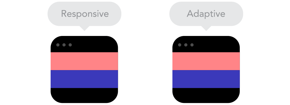
Responsive web design vs. adaptive
It may seem the same but it is not. Both approaches complement each other, so there is no right or wrong way to do it. Let the content decide.
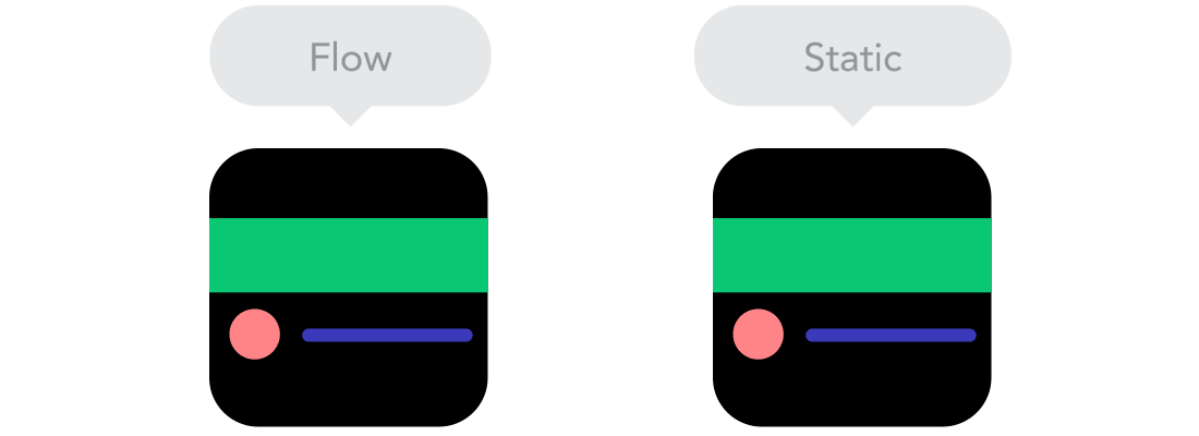
The flow
As screen sizes get smaller, content starts to take up more vertical space and everything underneath will be pushed down, it's called flow. It can be difficult to understand if you are used to designing with pixels and dots, but it makes perfect sense when you get used to it.
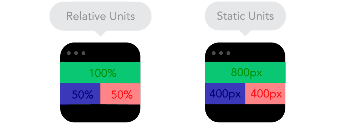
Relative units
The canvas can be a desktop, a mobile screen, or anything in between. Pixel density can vary as well, so we need units that are flexible and work everywhere. That's where relative units like percentages come in handy. So doing something with a width of 50% means that it will always take up half the screen (or viewport, which is the size of the open browser window).
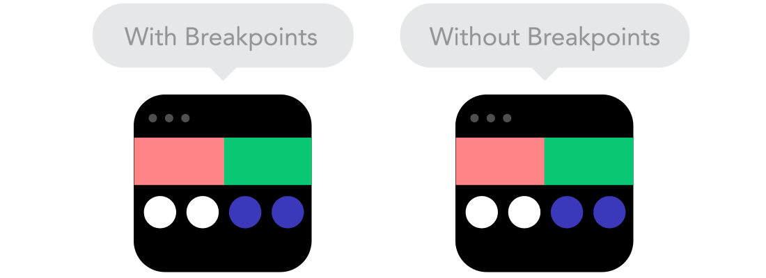
Cut points
Breakpoints allow the layout to change at pre-defined points, that is, having 3 columns on a desktop, but only 1 column on a mobile device. Most CSS properties can be changed from one breakpoint to another. Usually where you put one depends on the content. If a sentence is broken, you may need to add a breakpoint. But beware: it can get messy quickly when it's hard to understand what's influencing what.
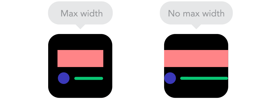
Maximum and minimum values
Sometimes it's great that content spans the entire width of a screen, like on a mobile device, but having the same content spanning the entire width of your TV screen often makes less sense. That is why the Min / Max values help. For example, having a width of 100% and a maximum width of 1000 px would mean that the content will fill the screen, but not exceed 1000 px.
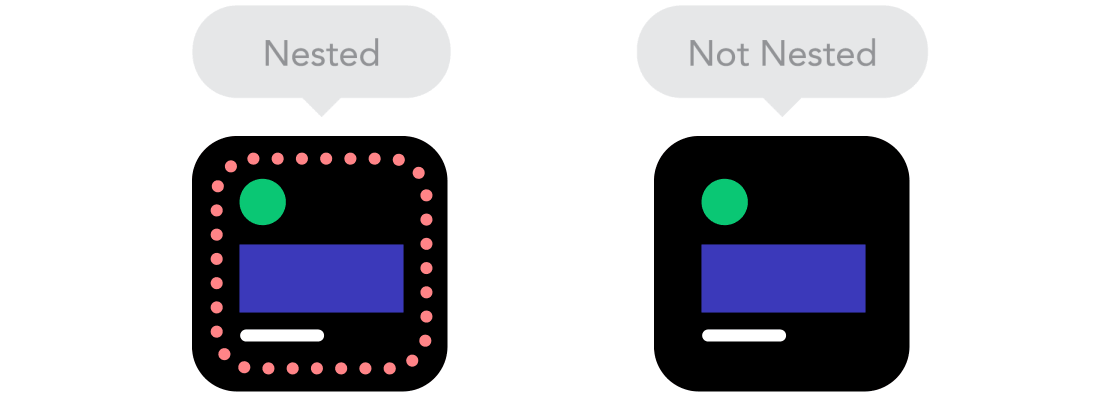
Nested objects
Do you remember the relative position? Having many items depending on each other would be difficult to control, therefore wrapping the items in a container makes it much more understandable, neat and tidy. This is where static units like pixels can help. They are useful for content that you don't want to scale, such as logos and buttons.
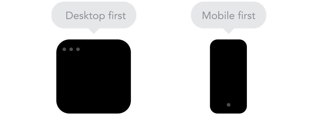
Mobile or desktop first
Technically, it doesn't make much difference whether a project starts from a smaller screen to a larger one (mobile first) or vice versa (desktop first). However, the future is mobile devices. People often start at both ends at the same time, so you really have to see what works best for you.
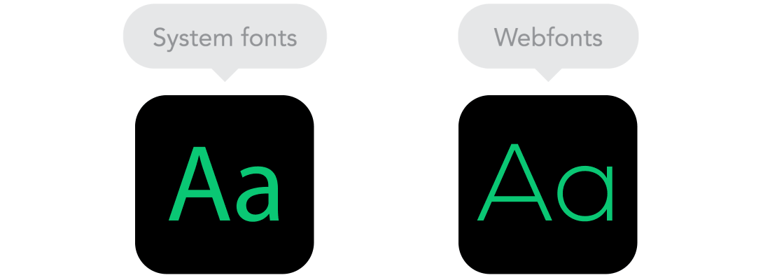
Webfonts vs system fonts
Do you want to have a Future or Didot cool looking on your website? Use webfonts! Although they will look impressive, remember that each one will be downloaded and the more you have on your website, the longer it will take to load the page. System fonts, on the other hand, are very fast, except when the user doesn't have it locally, it will fall back to a default font.
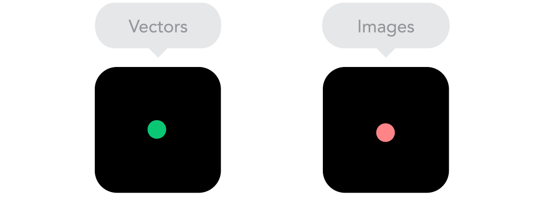
Bitmap vs vector images
Does your icon have a lot of details and some fancy effects applied? If yes, use a bitmap. If not, consider using a vector image. For bitmaps use a jpg, png or gif, for vectors the best choice would be an SVG or icon font. Each has some benefits and some drawbacks. However, let's consider the size: no image should be online without optimization. A page with very heavy photos in addition to worsening the user experience, you could also see your organic positioning affected. Vectors, on the other hand, are often small, but some older browsers don't support it. Also, if you have a lot of curves, it can be heavier than a bitmap, so choose wisely.
