How to format the Power BI column chart with an example? Formatting the Power BI column chart includes changing the bar color, title position, background colors, and adding data labels, and more.
To demonstrate these column chart formatting options, we'll use the column chart we created earlier. See the article Column chart in Power BI to understand the steps required to create a Power BI column chart.
How to format the Power BI column chart
Click on the Format to see the list of available formatting options for this column chart.
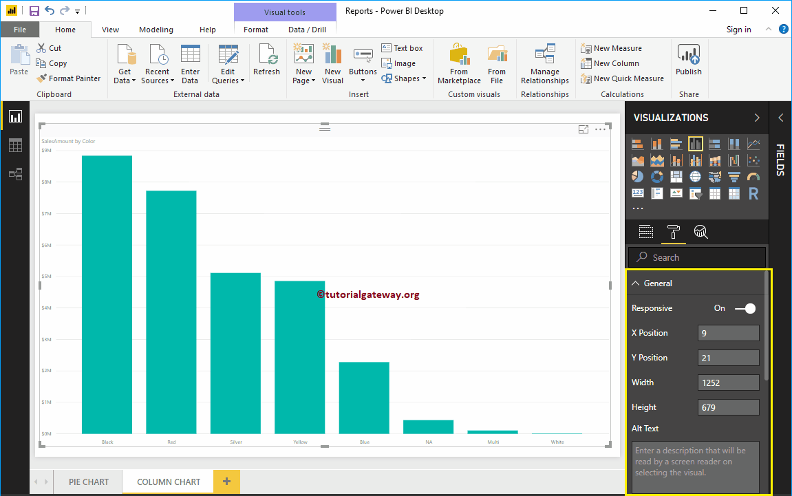
Use the general section to change the X, Y position, width and height of a column chart
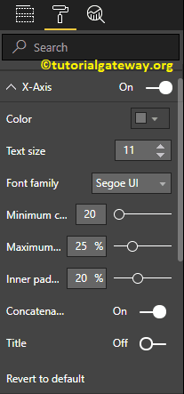
Format the X-axis of a Power BI column chart
Change the X-axis option from Off to In to format the X axis labels. Below is the list of options that are available to format the horizontal axis
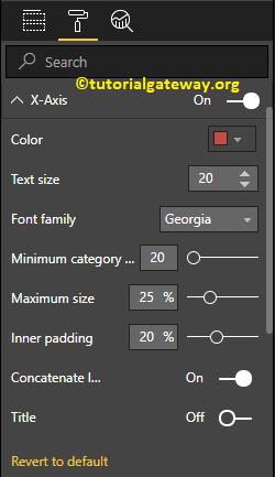
As you can see in the following screenshot, we changed the color to brick red, the font style to Georgia, and the text size to 20. The minimum category, maximum size and inner fill options are for changing the bar widths.
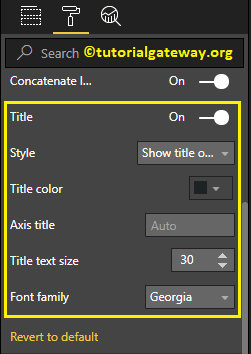
By default, the X-axis title is off. But you can enable it by toggling Title to In. Let me change the title color to dark gray, the font style to Georgia, and the title text size to 30
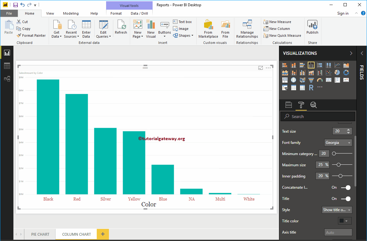
In the following screenshot, you can see the changes we made in X-Axis.
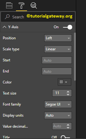
Format the Y-axis of the Power BI column chart
By toggling the Y-axis option from Off to In, You can format the Y-axis labels. The following is the list of options that are available for formatting the vertical axis or the Y-axis.
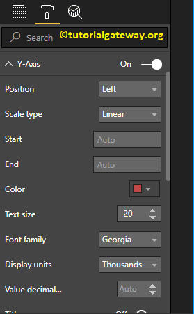
In the screenshot below, you can see that we changed the Y-axis label color to brick red, the text size to 20, the font style to Georgia, and the display units to thousands.
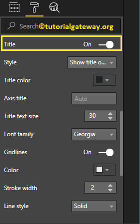
By default, the Y-axis title is off. But you can enable it by toggling Title in Y Axis section to In. Let me change the title color to dark gray, the font style to Georgia, and the title text size to 30.
By toggling the Grid lines option from On to Off, you can disable the grid lines.
- Colour: You can change the color of the grid.
- Stroke width: Use this to change the width of the grid. Here, we change the width from 1 to 2 default strokes.
- Line Style: Choose the line style like Solid, Dotted, etc.
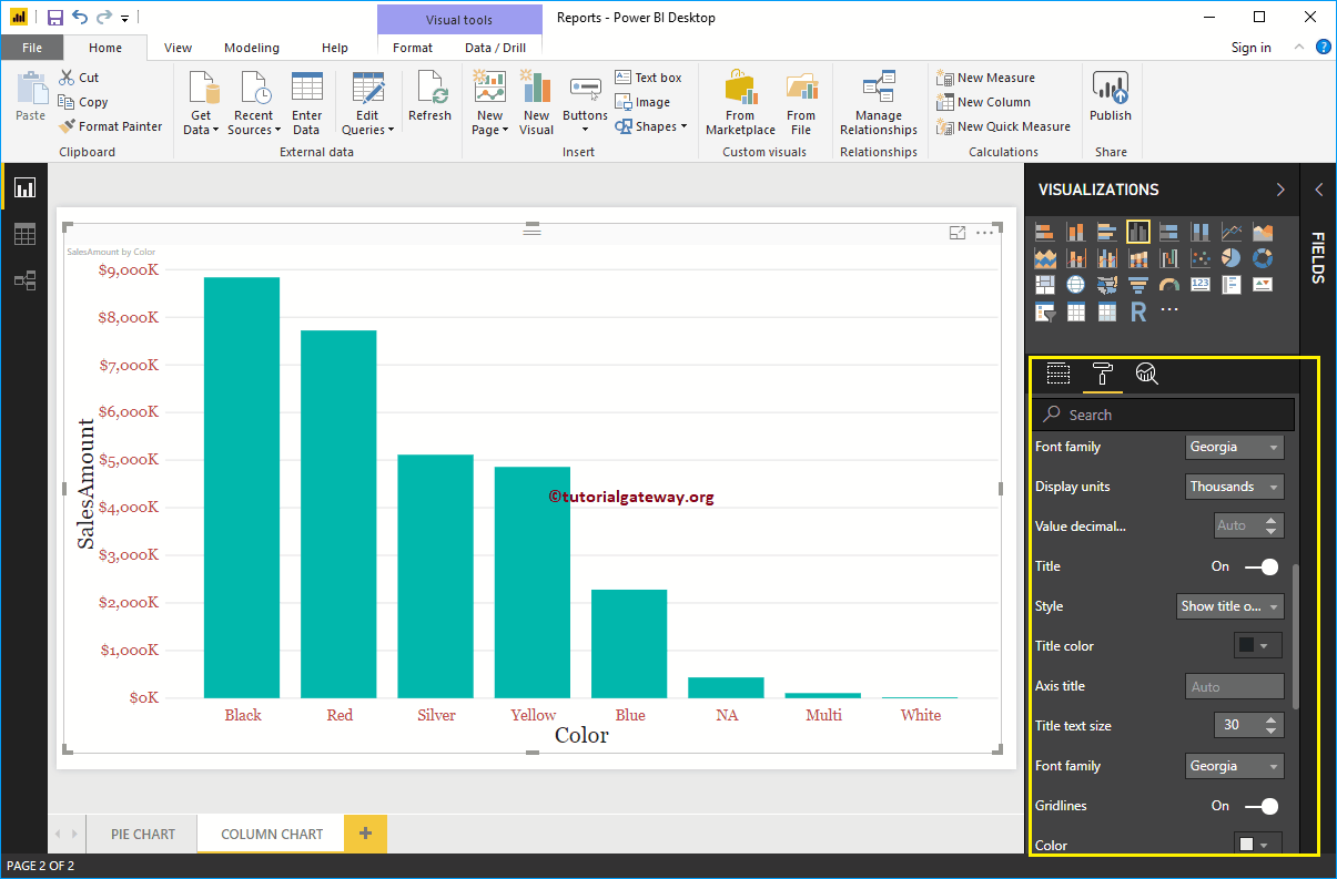
In the following screenshot you can see all the changes we made so far on the Y axis.
Format Power BI column chart data colors
By default, all the bars in the column chart are displayed in a single default color. This section of data colors is used to change the colors of the bars.
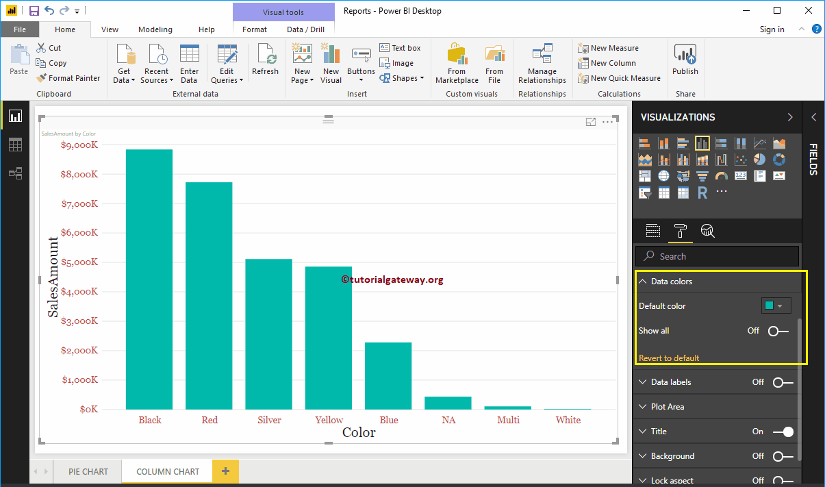
First, toggle Show everything options Off to In. Allows you to choose the individual color for each bar.
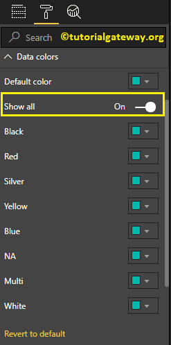
For demonstration purposes, we changed the colors of all existing bars.
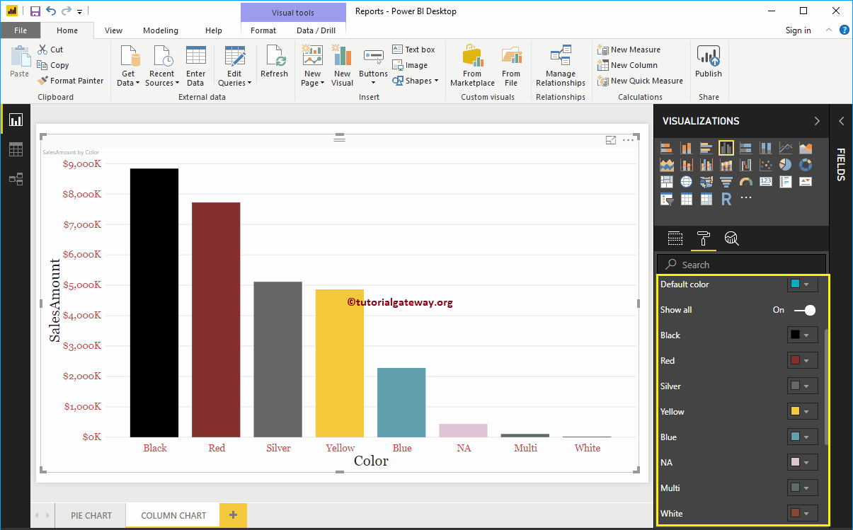
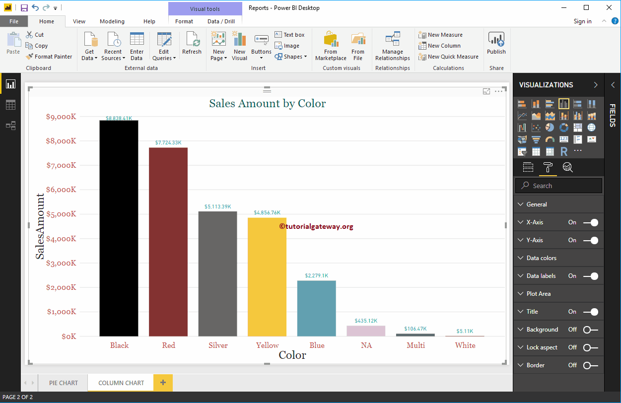
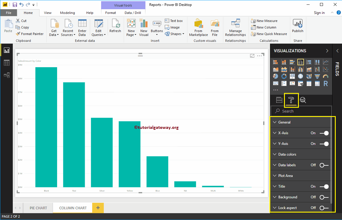
Enable data labels for Power BI column chart
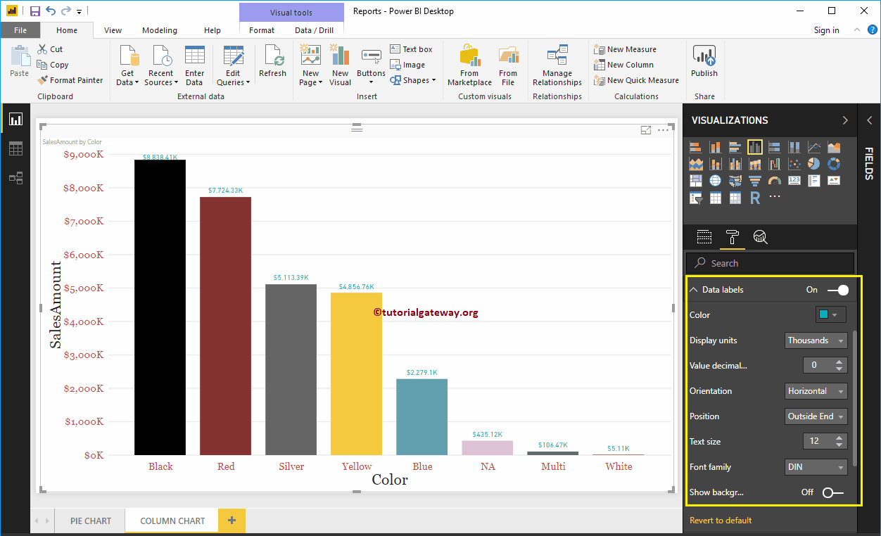
Data labels show information about the bar. In this case, it shows the sales amount for each bar. To enable data labels, toggle Data labels option a In.
Let me change the color to green Display units from Automatic to Thousands, Position to Outer End (Top of Bar), Text Size to 12 and Font Family to DIN. You can also add a background color to data labels by enabling Show Background

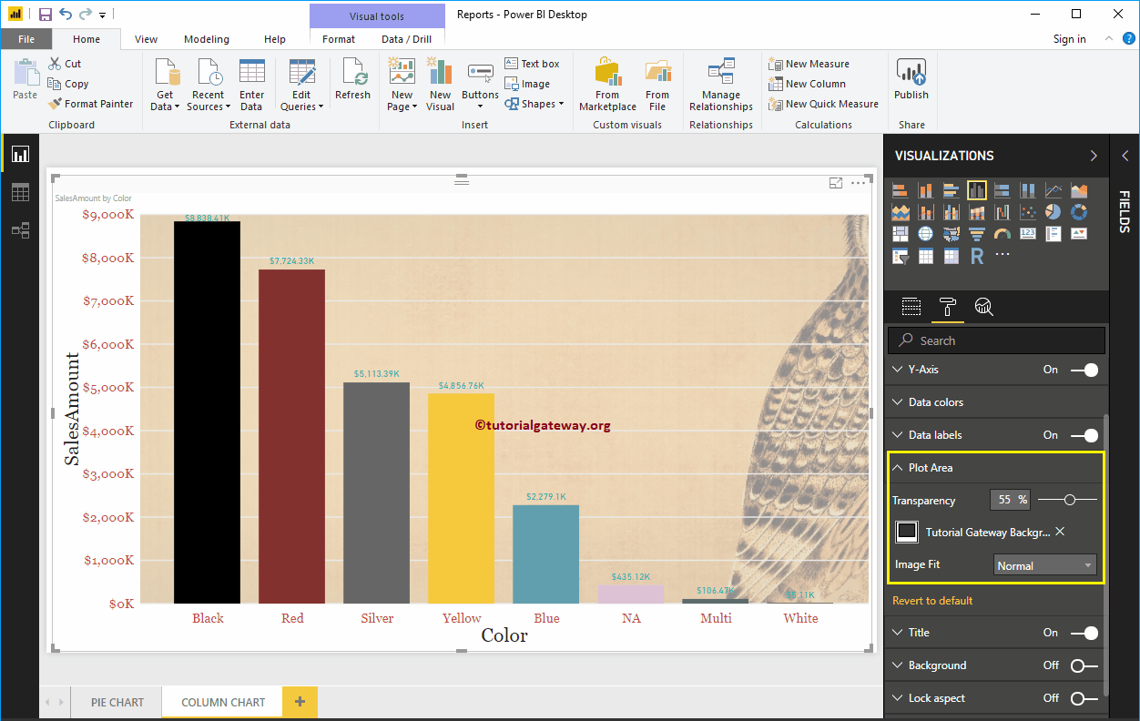
Format the Power BI column chart plot area
You can add images as a background using the Plot Area section. For demonstration purposes, we added an image as the background of the plot area.

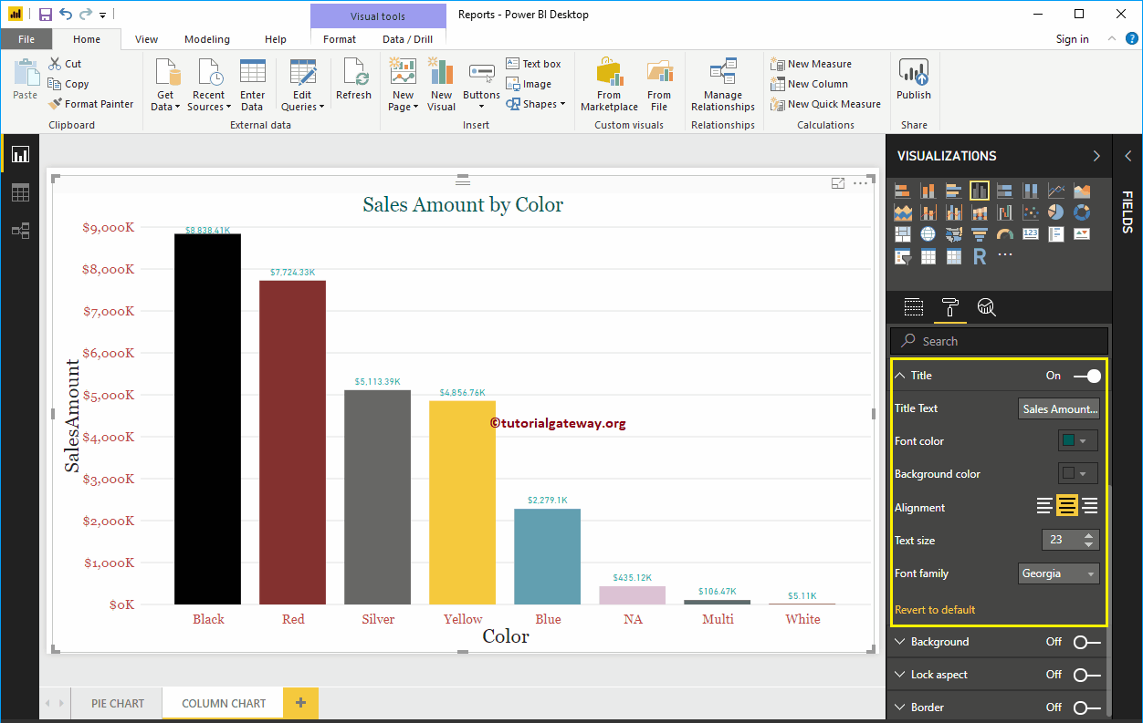
Format the Power BI column chart title
Select the title and change the option to Off to In to display the title of the Column Chart. As you can see in the following screenshot, we changed the Title Text to Sales Amount by Color. Next, font color to green, font style to Georgia, font size to 23, and title alignment to center. If you want, you can also add the background color to the title.

Add background color to column chart in Power BI
You can add background color to column chart by toggling Background option a In. For demonstration purposes, we are adding a background color. Here you can also change the transparency percentage.

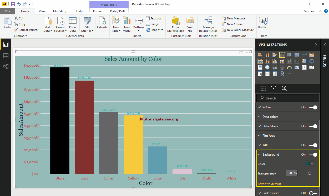
It does not look very good. Let me remove the background color by clicking on the Return to default option
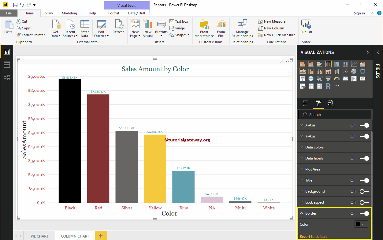
Enable edge-to-column chart in Power BI
You can add borders to the column chart by toggling the Border option of Off to In. For demonstration purposes, we enabled Borders and added Dark Gray as the Border color.

The following screenshot shows the column chart after formatting