The Power BI stacked 100% bar chart displays the metric information in percentages. Let me show you how to create a 100% stacked bar chart in Power BI with an example.
For this Power BI stacked 100% bar chart demo, we will use the SQL data source that we created in our previous article. Therefore, see the article Connect Power BI to SQL Server to understand the Power BI data source.
How to create a stacked 100% bar chart in Power BI
To create a Power BI stacked 100% bar chart, first drag and drop the Sales Amount section of the fields to the region of the canvas. Automatically create a column chart, as shown below.
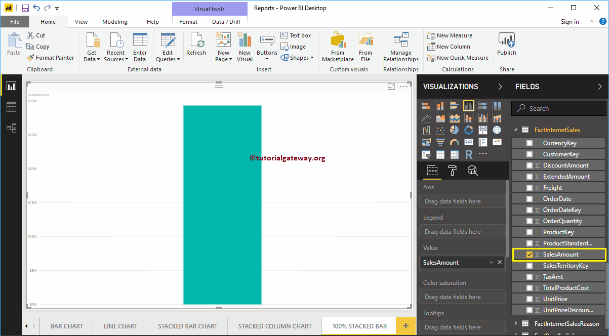
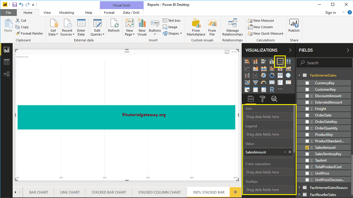
Clicking on the 100% bar chart stacked below the Display section automatically converts column chart to stacked bar chart at 100%
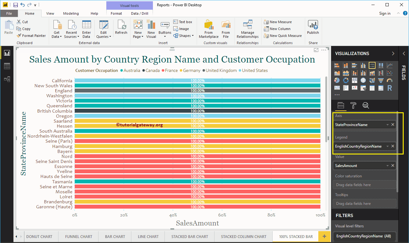
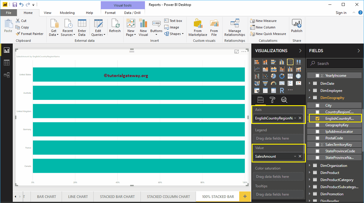
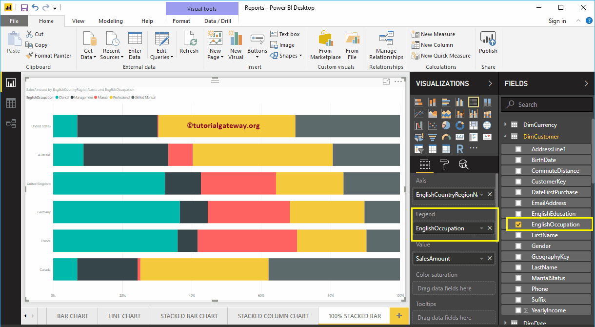
Next, let me add the name of the English country region to the Axis section to create a bar chart of the 100%. This chart shows the number of sales (in percent) by country region name in English.
We then added the Occupancy section to the legend to make it the 100% stacked bar chart.
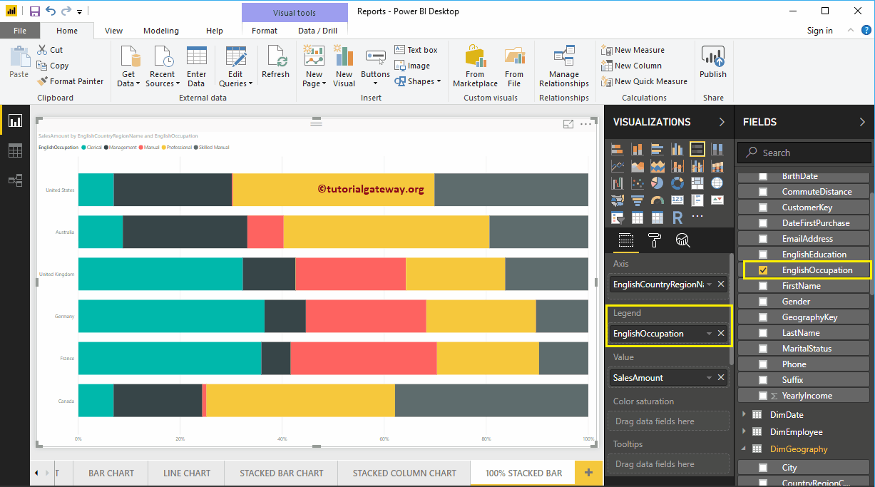
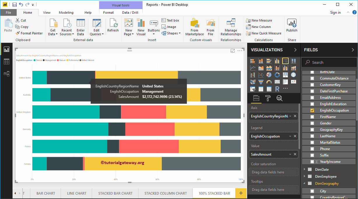
Hover over any part of a bar that will show you the tooltip for Country Name, Customer Occupation, and Sales Amount.
Create Stacked 100% Bar Chart in Power BI Approach 2
First, click on the 100% bar chart stacked below the Display section. Automatically creates a 100% stacked bar chart with dummy data, as shown in the following screenshot.
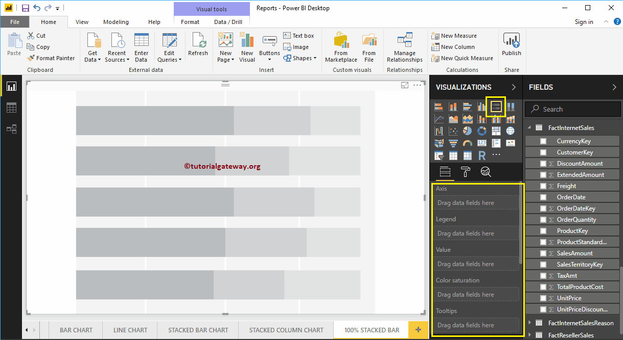
To add data to the stacked bar chart to the 100%, we have to add the required fields:
- Axis: Specify the column that represents the horizontal bars.
- Legend: Specify the column to split the horizontal bars.
- Values: Any metric value, such as sales amount, total sales, etc.
Let me drag the Sales Amount from the Fields section to the Values field and the English Country Region Name field to the Axis Section.
Then add the English Occupation from the DimCustomer table to the Legend section. You can do this by dragging Occupation to the Legend section, or simply check the Occupation column in English.
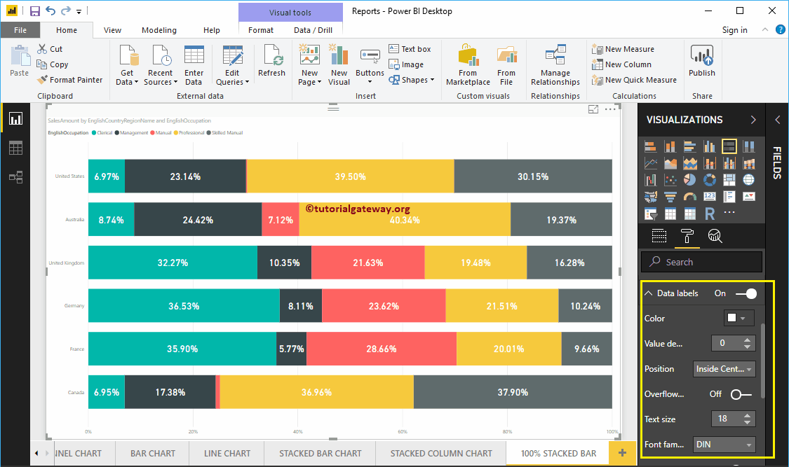
Data labels display information about each group on a horizontal bar (country). In this case, it shows the Sales Amount (in percentage) for each occupation. Let me enable data labels so you can see the percentage of each group.
To enable data labels, go to Format tab and toggle Data labels option a In. Let me change the color to white, the font family to DIN, and the text size to 18
You can now see a stacked 100% bar chart with percentage values
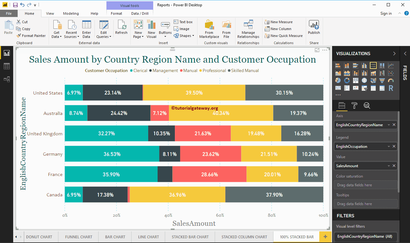
Let me apply a quick format to this Power BI stacked 100% bar chart
NOTE: The formatting options for the stacked bar chart and the stacked 100% bar chart are the same. Therefore, I suggest that you refer to the Stacked Bar Chart Format article to understand the steps required to format the stacked bar colors to the 100%.
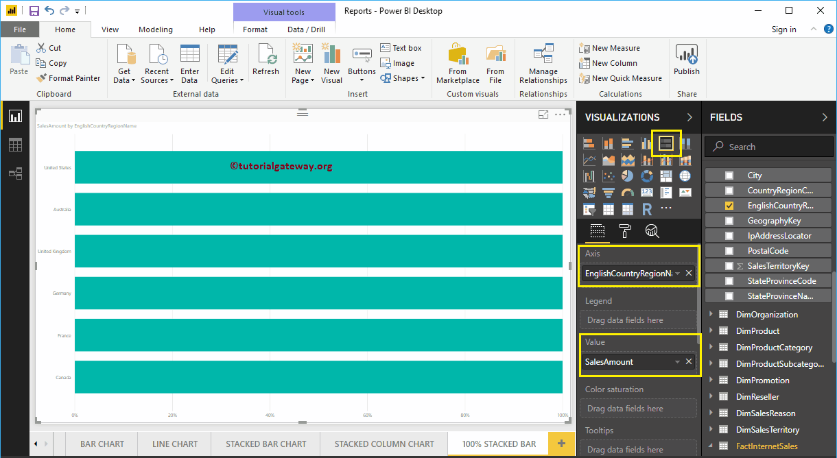
This time, we added the name of the state province to the axis and the country to the legend to get a stacked bar chart at 100%. In the following screenshot, you can see that the country name acts as the color of the bar. This is because you cannot group country names within a state (inherited state name from country).