

the Archive posts The widget displays a list of the posts within the archive templates, which are created in Templates> Theme Builder> File.
Note: The number of posts per page is controlled from the WordPress reading settings (Control Panel> Settings> Reading)
Content
Design
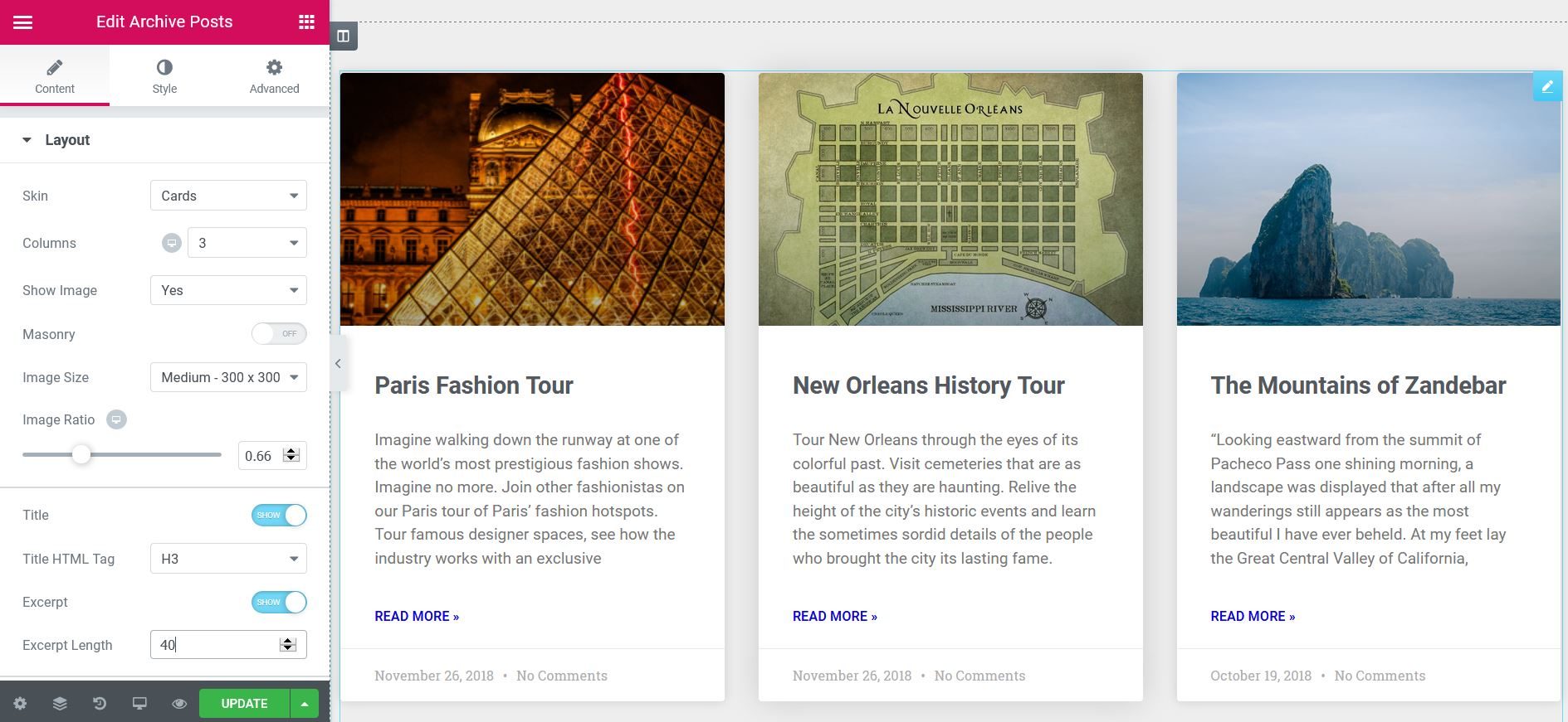
- Skin: Select a predesigned skin, either Classic or Cards
- Columns: Sets how many columns will be displayed, from 1 to 6
- Image position: Sets the position of the image in relation to the content. Options include: Up / Left / Right / None
- Brickwork: Slide in or out
- Image size: Sets the image size, from thumbnail to full
- Image ratio: Sets the exact proportion of images
- image width: Sets the exact width of the images
- Title: Choose to show or hide the title
- Title HTML tag: Select the HTML tag to be used for the title, from H1 to H6, or div, span op
- Abstract: Choose to show or hide the statement
- Excerpt length: Choose the length of the excerpt, setting the exact number of words displayed
- Metadata: Select the metadata to be displayed in the widget. A click on the field opens the list of options. Options include author, date, time, and comments.
- read more: Show or hide the Read more button
- Read more text: Customize the text Read more
- Badge (Only available if card layout is selected) - Slide to YES to display the badge
- Badge Taxonomy (Only available if the Cards mask is selected): Select the taxonomy to be used for the badge, choosing from Categories, Tags, etc.
- Avatar (Only available if the Cards mask is selected): show or hide the author's avatar
Note: When Elementor displays a post, if you don't have an excerpt, Elementor automatically generates an excerpt from the post content. the Excerpt length The option allows you to control the length of this automatically generated extract. However, the excerpt length only applies to posts where no manual excerpts have been entered. The length specified in the Elementor widget is ignored if there is a manually generated excerpt for a post.
Pagination
- Pagination: Choose how you want to paginate the results. Options include None, Numbers, Previous / Next, or Numbers + Previous / Next
- Page limit: Limit paging to the number you enter here.
- Shorten: If there are many pages of results, this adds an ellipsis (…) between the first pages and the last pages. that is, 1 2 3…. 8 9
- Previous label / Next label: Enter the text to be used for the Previous and Next labels. The option is only available if Previous / Next or Numbers + Previous / Next was chosen for pagination.
- Alignment: Aligns pagination to the left, right, or center
Advanced
- Nothing found message: Enter the text to display when there are no posts to display.
Style
Design
- Column spacing: Sets the exact space between the columns
- Row spacing: sets the exact space between the rows
- Alignment: Sets the alignment of the content in the widget as left, center or right
Card (only displayed if card layout chosen)
- Background color: Choose the background color of the card
- Border color: Choose the color of the card border
- Border width: Sets the thickness of the border around the card
- Edge radius: Sets the roundness of the card edge corners
- Horizontal padding: Sets the horizontal fill of the card content
- Vertical padding: Sets the vertical padding of the card content
- Shadow of the box: Choose Yes to apply a predefined box shadow to the card
- Scroll effect: Select an offset effect, None or Gradient
- Meta border color: Choose the border color over the metadata
Image
- Spacing: Sets the exact spacing between the image and the content
- CSS filters: Adjusts the picture style by changing the CSS filter scales for Blur, Brightness, Contrast, Saturation, and Hue adjustments
Badge (Only available if Card skin is chosen)
- Badge position: Aligns the badge to the left or right of the card
- Background color: Choose the background color of the badge
- Text color: Choose the color of the logo text
- Edge radius: Sets the radius of the border to control the roundness of the corners
- Size: Sets the size of the badge
- Margin: Control the distance of the badge from the top and side of the card
- Typography: Sets the typography of the badge text
Avatar (Only available if Card skin is chosen)
- Size: Sets the size of the avatar.
Content
Title
- Colour: Sets the color of the titles
- Typography: Sets the font for the titles
- Spacing: Sets the space between the title and the content
Goal (Only available if Card skin is chosen)
- Colour: Sets the metadata color
- Separator color: Sets the color of the metadata separator
- Typography: Sets the font of the metadata
Abstract
- Colour: Sets the color of the abstract
- Typography: Sets the font of the extract
- Spacing: Set the space between the excerpt and the longest reading
read more
- Colour: Sets the color of the reading
- Typography: Set the font to read more text
- Spacing: Sets the space between the most read text and the bottom of the post box
Pagination
- Typography: Sets the font for the pagination text
- Colour: Choose the color of the pagination text for Normal, Hover and Active states
- Space between: Sets the space between pagination elements
Nothing found message
- Colour: Choose the message color
- Typography: Sets the font of the message


