

Orchestrating animations with promise, performance improvements with replaceable animations, smoother animations with compound modes, and more.
When used correctly, Animations improve user perception and memory. your brand, guide user actions and help users navigate your application, providing context in a digital space.
the Web animations API is a tool that allows developers to write Imperative animations with JavaScript. It was written to support CSS transition and animation implementations and to allow for the development of future effects, as well as the composition and timing of existing effects.
While Firefox and Safari have already implemented the full set of specs features, Chromium 84 brings a host of previously unsupported features for Chrome and Edge allowing interoperability between browsers.
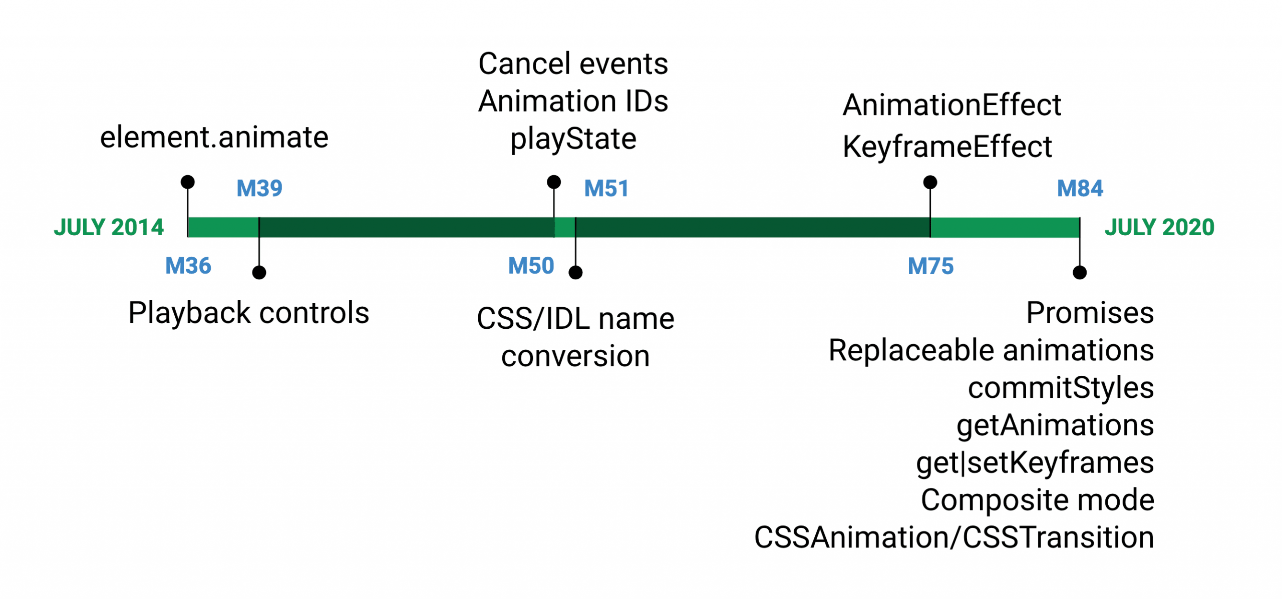
The long history of the Web Animation API in Chromium.
Starting
Creating an animation via the Web Animations API should be very familiar to you if you've used @keyframe rules. First, you will need to create a keyframe object. What could look like this in CSS:
@keyframes openAnimation {
 0% {
 transform : scale ( 0 ) ;
 }
 100% {
 transform : scale ( 1 ) ;
 }
 }
it would look like this in JavaScript:
const openAnimation = [
 { transform : 'scale (0)' } ,
 { transform : 'scale (1)' } ,
 ] ;
Where you set the parameters for the animation in CSS:
.modal {
 animation : openAnimation 1s 1 ease-in ;
 }
you would set in JS:
document . querySelector ( '.modal' ) . Animate (
 openAnimation , {
 duration : 1000 ,
 iterations : 1 ,
 easing : 'ease-in'
 }
 ) ;
The amount of code is roughly the same, but with JavaScript, you get a couple of superpowers that you don't have with just CSS. This includes the ability to sequence effects and greater control of their game states.
Hyphenated property names are converted to uppercase and lowercase when used in keyframes (eg. background-color to backgroundColor)
Beyond element.animate ()
However, with the update, the Web Animations API is no longer restricted to animations created via element.animate (). We can also manipulate CSS transitions and animations.
getAnimations () is a method that returns all animations of an element regardless of whether it was created by element.animate () or through CSS rules (CSS animation or transition). Here's an example of what this looks like:
You first "get" keyframes of the transition to determine where we are transitioning from. Next, create two new opacity animations, enabling the crossfade effect. Once the crossfade is complete, erase the copy.
Orchestrating animations with promises
In Chromium 84, you now have two methods that can be used with promises: animation.ready and animation.finished.
animation.readyallows you to wait for pending changes to take effect (that is, switch between playback control methods such as play and pause).animation.finishedprovides a means of executing custom JavaScript code when an animation completes.
Let's continue with our example and create an animation chain orchestrated with animation.finished. Here you have a vertical transformation (scaleY), followed by a horizontal transformation (scaleX), followed by an opacity change on a child:
Apply transformations and opacity to an opening modal element. See demo in Codepen
const transformAnimation = modal . animate ( openModal , openModalSettings ) ;
 transformAnimation . finished . then ( ( ) => { text . animate ( fadeIn , fadeInSettings ) } ) ;
We have chained these animations using animation.finished.then () before executing the next animation set in the chain. This way the animations appear in order and you even apply effects to different target elements with different options set (like speed and ease).
Within CSS, this would be tricky to recreate, especially when applying single but sequenced animations to multiple elements. You would have to use a @keyframe, rate the correct time percentages to place the animations and use animation-delay before activating the animations in the sequence.
Example: play, pause and reverse
What can be opened should be closed! Fortunately, since Chrome 39, the Web Animations API has provided us with the ability to play, pause, and reverse our animations.
You can take the animation above and give it a smooth, inverted animation when you click the button again using .reverse (). In this way, you can create a smoother and more contextual interaction for our modal.
An example of modal opening and closing when a button is clicked. See demo in Glitch
What you can do is create two pending playback animations (openModaland an inline opacity transform), and then paused one of the animations, delaying it until the other finished. You can then use the promises to wait for them to finish before playing. Finally, you can check if there is a flag set and then reverse each animation.
Example: dynamic interactions with partial keyframes
Example of redirection, where a mouse click snaps the animation to a new location. See demo in Glitch
selector . animate ( [ { transform : ` translate ( $ { x } px, $ { y } px) ` } ] ,
 { duration : 1000 , fill : 'forwards' } ) ;
In this example, there is only one keyframe and there is no specified start position. This is an example of use partial keyframes. The mouse controller does a few things here: it sets a new ending location and triggers a new animation. The new starting position is inferred from the current underlying position.
New transitions can be activated while existing ones are still running. This means that the current transition is interrupted and a new one is created.
Performance improvements with replaceable animations
When creating event-based animations, as in 'mousemove', a new animation is created each time, which can quickly consume memory and degrade performance. To address this issue, replaceable animations were introduced in Chromium 83, allowing automatic cleanup, where finished animations are marked as replaceable and are automatically removed if replaced by another finished animation. Consider the following example:
A comet trail animates when the mouse is moved. See demo in Glitch
elem . addEventListener ( 'mousemove' , evt => {
 rectangle . Animate (
 { transform : translate ( $ { evt . clientX } px , $ { evt . clientY } px ) } ,
 { duration : 500 , fill : 'forwards' }
 ) ;
 } ) ;
Each time the mouse is moved, the browser recalculates the position of each ball on the comet's trail and creates an animation for this new point. The browser now knows how to remove old animations (allowing replacement) when:
- The animation is finished.
- There are one or more animations higher in the compound order that are also finished.
- The new animations are animating the same properties.
You can see exactly how many animations are being replaced by counting a counter with each animation removed, using anim.onremove to activate the counter.
There are a few additional methods to take your animation control even further:
animation.replaceState ()provides a means of tracking whether an animation is active, persistent, or removed.animation.commitStyles ()updates an element's style based on the underlying style along with all the element's animations in compound order.animation.persist ()marks an animation as non-replaceable.
animation.commitStyles () and animation.persist () they are commonly used with composition modes, such as "add." Check out the Composite Modes demo below to see them in action.
Smoother animations with compound modes
With the Web Animation API, you can now set the composite mode of your animations, which means they can be additive or cumulative, in addition to the default "replace" mode. Composite modes they allow developers to write different animations and have control over how the effects are combined. Three compound modes are now supported: 'replace' (the default mode), 'add'and 'accumulate'.
When composing animations, a developer can write short, distinct effects and see them combined. In the example below, we are applying a rotation and scaling keyframe to each frame, and the only setting is composite mode, added as an option:
A demo showing the default compound modes, add, and accumulate. See demo in Glitch
Default 'replace' composite mode, the final animation overrides the transform property and ends in rotate (360deg) scale (1.4). by 'add', compound adds the rotation and multiplies the scale, resulting in a final state of rotate (720deg) scale (1.96). 'accumulate' combines the transformations, resulting in rotate (720deg) scale (1.8). For more information on the complexities of these composite modes, see The CompositeOperation and CompositeOperationOrAuto enumerations of the web animations specification.
Let's take a look at an example UI element:
A bouncy dropdown menu that has two compound animations applied to it. See demo in Glitch
Here two top animations are composed. The first is a macro-animation, which moves the drop-down menu to the full height of the menu itself as a sliding effect from the top of the page, and the second, a micro-animation, applies a small bounce when it hits the bottom . Using the 'add' Composite mode allows for a smoother transition.
const dropDown = menu . Animate (
 [
 {Top: `$ {-} menuHeight` px, easing: 'ease-in'},
 { top : 0 }
 ] , { duration : 300 , fill : 'forwards' } ) ;

 dropDown . finished . then ( ( ) => {
 const bounce = menu . Animate (
 [
 { top : '0px' , easing : 'ease-in' } ,
 { top : '10px' , easing : 'ease-out' } ,
 { ... }
 ] , { duration : 300 , composite : 'add' } ) ;
 } ) ;
What's next for the web animations API?
These are all exciting additions to the animation capabilities in current browsers, and even more additions are yet to come. Check out these future specs for more information on what's coming next:


